NATIVE
Every chart is real
Bar, column, stacked, line and area — all native PowerPoint objects. Right-click, Edit Data, done. Nothing here is a screenshot pretending to be a chart.
Thirty executive reporting dashboards
A collection of professionally designed executive dashboard resources for presenting performance, priorities, metrics and operational information clearly.

OVERVIEW
Executive reporting fails in three predictable ways: numbers without movement, so the reader cannot tell whether anything changed; status colours without reasons, so they cannot tell what to do; and everything measurable rather than everything decision-relevant.
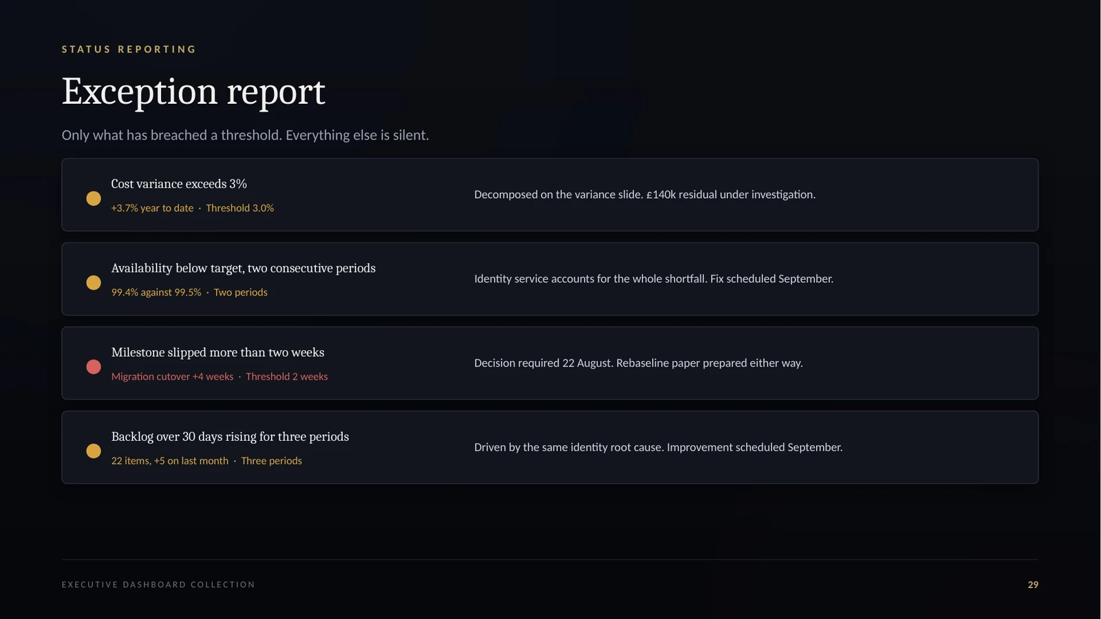
Thirty layouts across seven reporting domains — executive summary, portfolio, service, financial, business health, roadmaps and status reporting. A linked workbook holds every figure once, so the same measure cannot appear with two different values on two slides of the same pack.
FEATURES
NATIVE
Bar, column, stacked, line and area — all native PowerPoint objects. Right-click, Edit Data, done. Nothing here is a screenshot pretending to be a chart.
LINKED
Six sheets holding every figure in the collection, with variance, movement and headroom calculated rather than typed. Populate it once and the pack stays consistent.
DEFINED
What each measure includes, excludes, how it is calculated and what it is commonly confused with. Almost every dispute about a dashboard is a dispute about a definition.
TYPESET
Cambria and Calibri throughout — both ship with Office on Windows and Mac. Send the file to anyone and nothing reflows or substitutes.
RESTRAINED
Gold ramps where the bars are one measure, distinct colours only where the categories genuinely differ, two series maximum on a line chart, and no dual axes anywhere.
GUIDED
Every dashboard carries speaker notes explaining what it is for and how the equivalent one usually misleads a senior reader.
WHO IT IS FOR
Board and executive committee reporting where every figure will be tested and the answer has to be in the pack already.
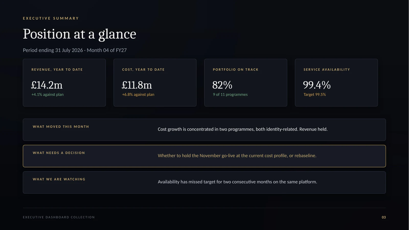
Availability against target, incident concentration, demand against capacity and the improvement pipeline — in one operating picture.
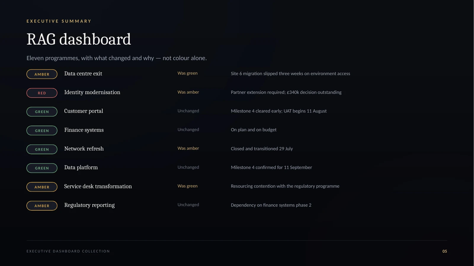
Portfolio health, milestone movement, benefits realisation and investment profile, with slippage evidenced rather than asserted.
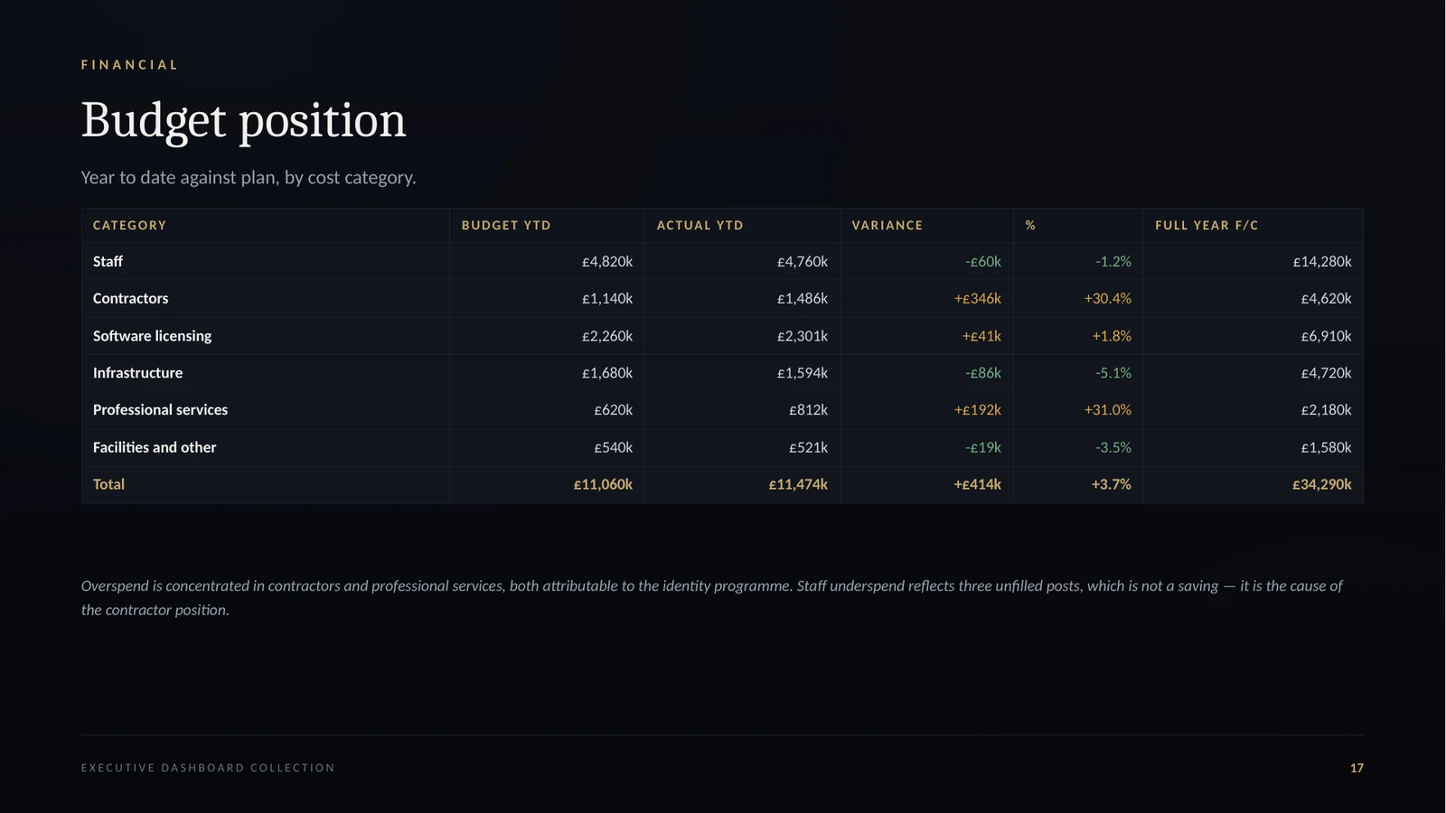
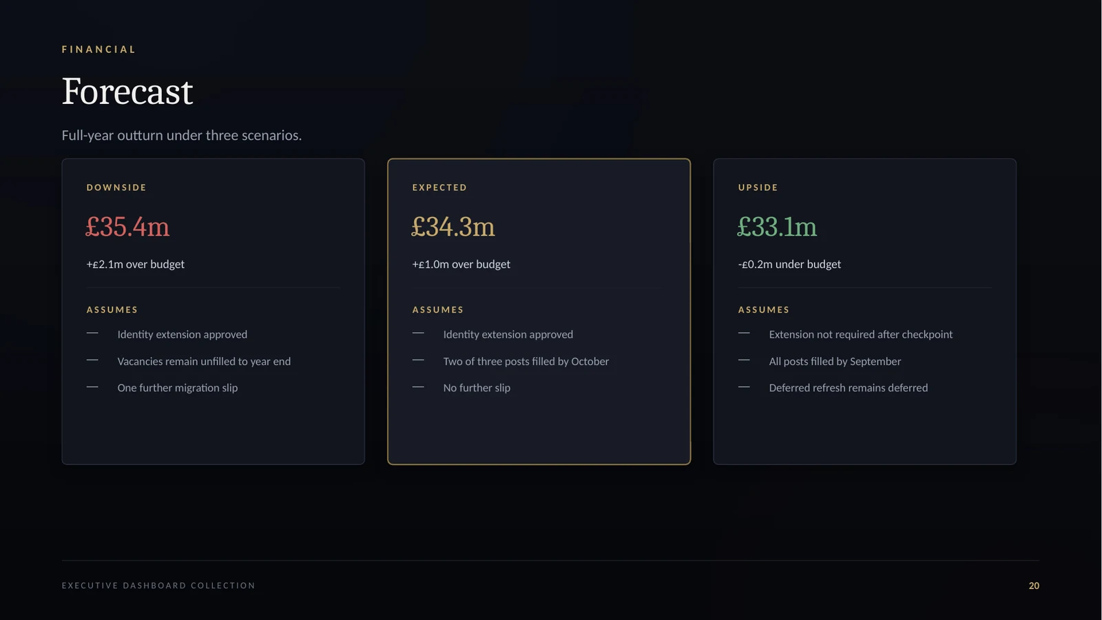
Budget position, variance decomposed to the total, scenario forecasting and unit cost read with its denominator.
GALLERY
WHAT’S INCLUDED
Thirty dashboard layouts in 16:9, with native charts and tables and speaker notes on every slide.
Six linked sheets holding every figure in the deck, with variance, movement and headroom calculated rather than typed.
Six reporting principles, six worked pack recipes by audience, and the seven questions every dashboard gets challenged with.
Forty-two measures across financial, delivery, service and business health, each with its calculation and what it is confused with.
Seven checklists for designing, populating, presenting and reviewing a reporting pack.
What is in the package, where to start, and how to build a pack for a specific audience.
What is in the package, where to start, and how to build a pack for a specific audience.
What changed, when, and what to re-download if you have an earlier copy.
FAQ
Eight files: the 30-dashboard PowerPoint collection and the linked data workbook, plus the Dashboard Guide, Metric Definitions, Dashboard Checklists, README, LICENSE and Version Notes.
REVIEWS
This product has just been published, so there are no customer reviews yet. We would rather show you an empty space than a testimonial we wrote ourselves.
Bought it? Tell us how it went — the first reviews will appear here.
Executive Dashboard Collection — thirty executive reporting dashboards.